
Syrianair – Visual Identity Redesign (Competition Entry)
Graphic Design
Project Overview
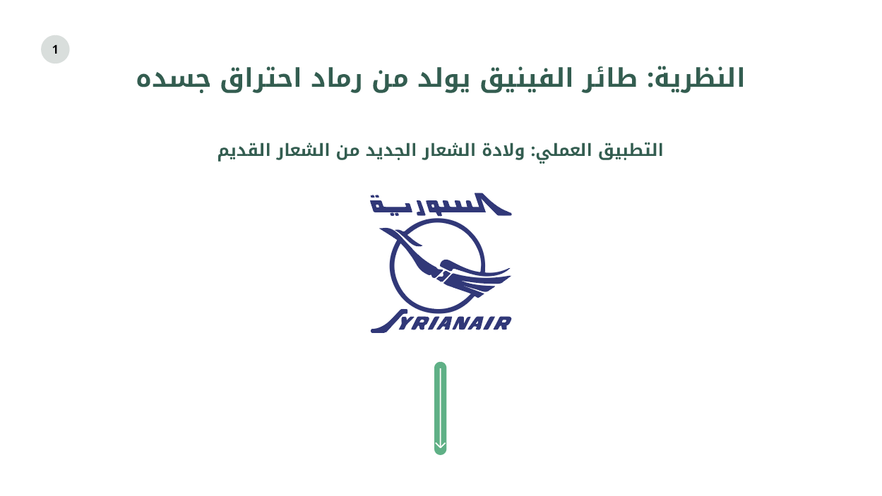
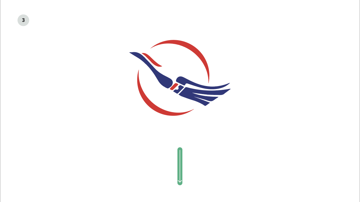
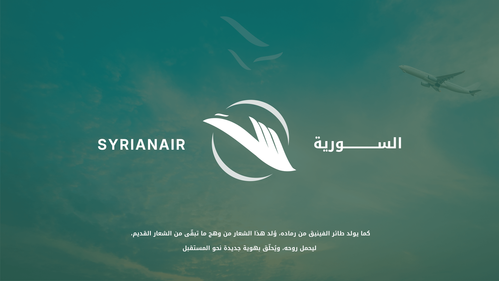
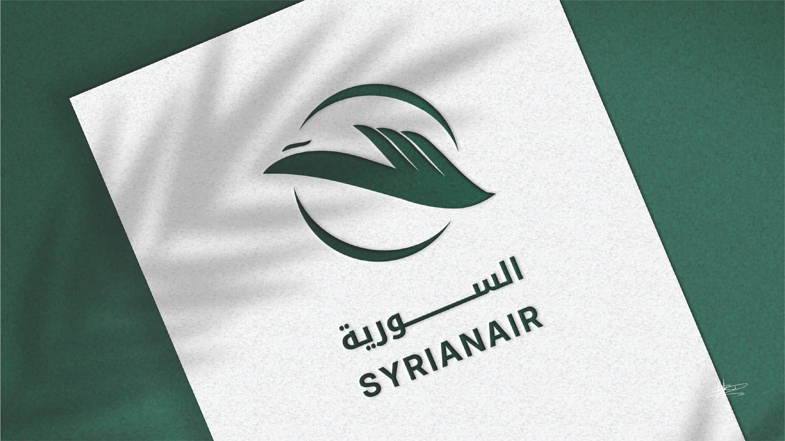
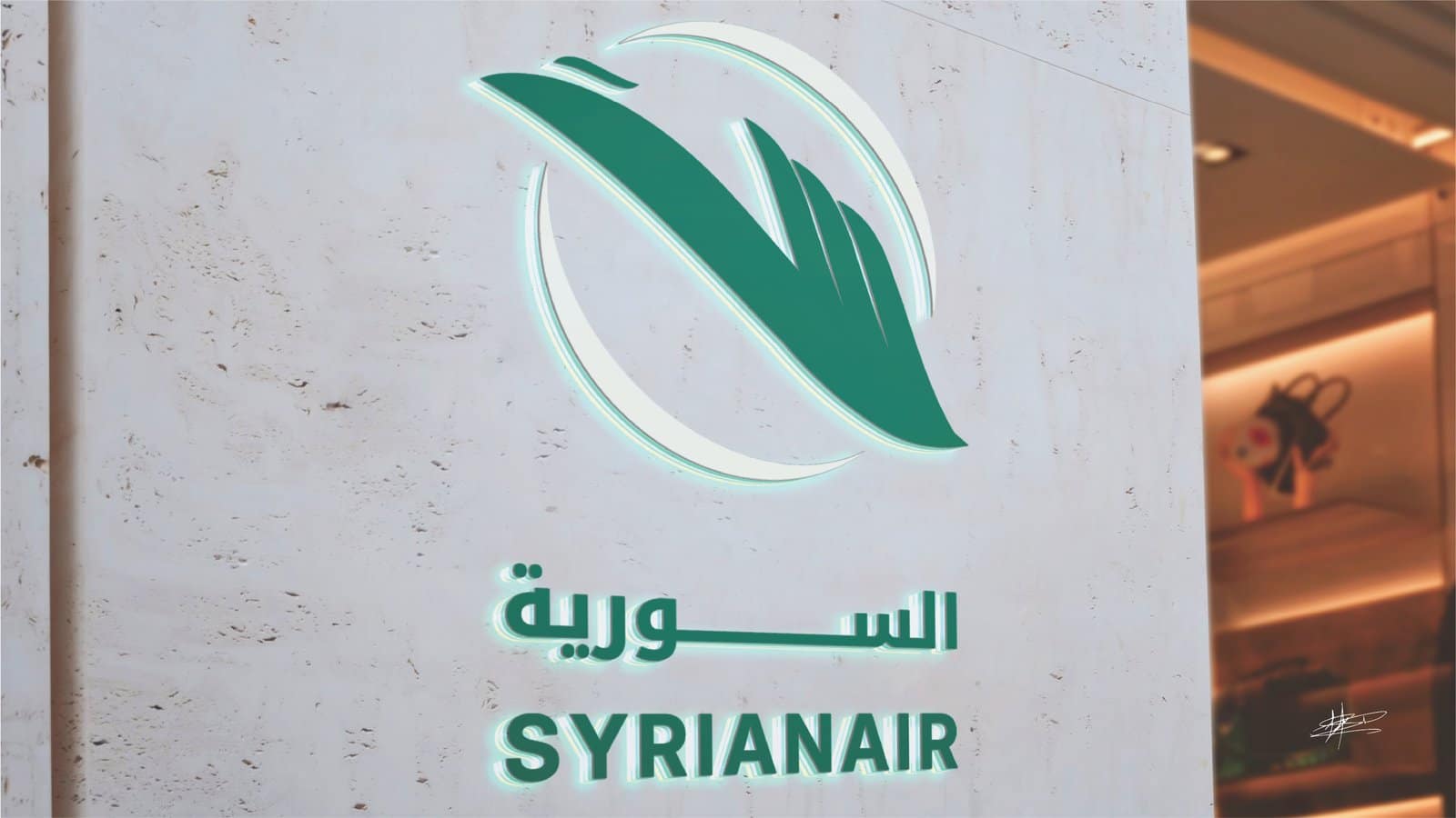
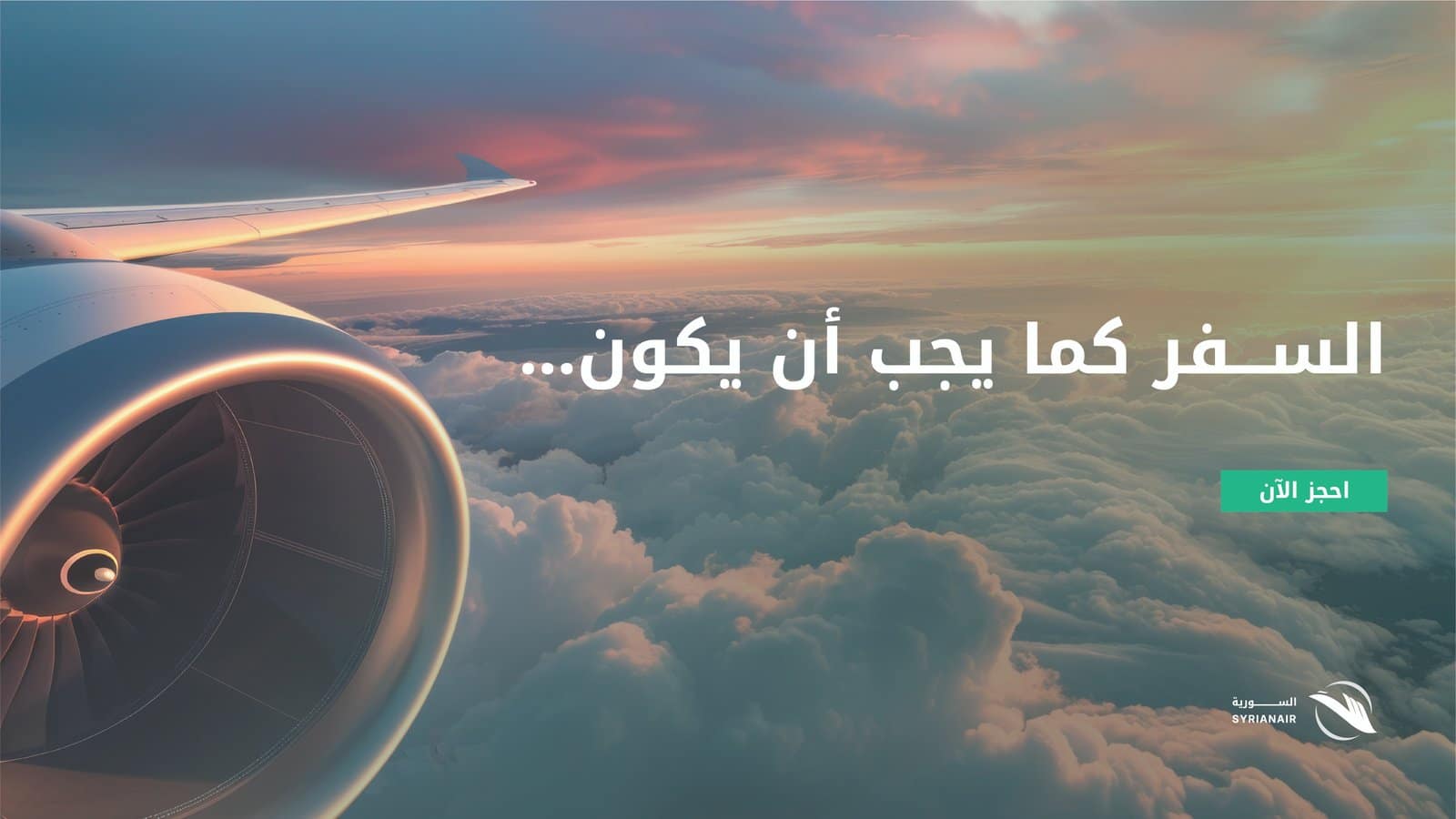
The Syrianair Rebranding & Identity System project was a creative and strategic redesign proposal for Syria’s national airline. The concept was deeply rooted in the legendary Phoenix — a bird that rises anew from the ashes of its own flames. In this rebranding, the phoenix’s rebirth is visually expressed through a modernized logo born from a distinctive element of the old emblem: The Arabic character “ة” (taa marbouta) above the phoenix’s head.
The new identity aimed to position Syrianair as a modern, elegant, and competitive airline that preserves its national heritage while embracing global design standards.
My Role:
- Lead Concept Designer & Brand Strategist: Developed the complete brand philosophy, visual identity system, and design guidelines.
- Creative Direction: Applied the phoenix rebirth theory into a practical, logo-centered design evolution.
- Identity Manual Creation: Built the brand book covering logo variations, grid system, typography, color palette, aircraft livery, and uniforms.
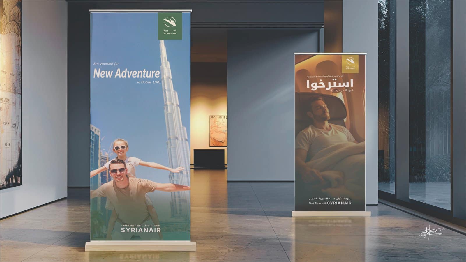
- Brand Application Design: Created real-world mockups for aircraft, staff uniforms, passenger classes, and marketing materials.
Project Goal:
To transform Syrianair’s outdated identity into a timeless, internationally competitive brand while maintaining its deep Syrian cultural roots. The goal was to create an identity system that is scalable, functional, and emotionally resonant, ensuring instant recognition locally and globally.
Quick Links:
Project Story
When approaching Syrianair’s rebranding, I started with a symbolic and philosophical foundation rather than a purely visual one. The phoenix — a symbol of renewal and resilience — became the core inspiration.
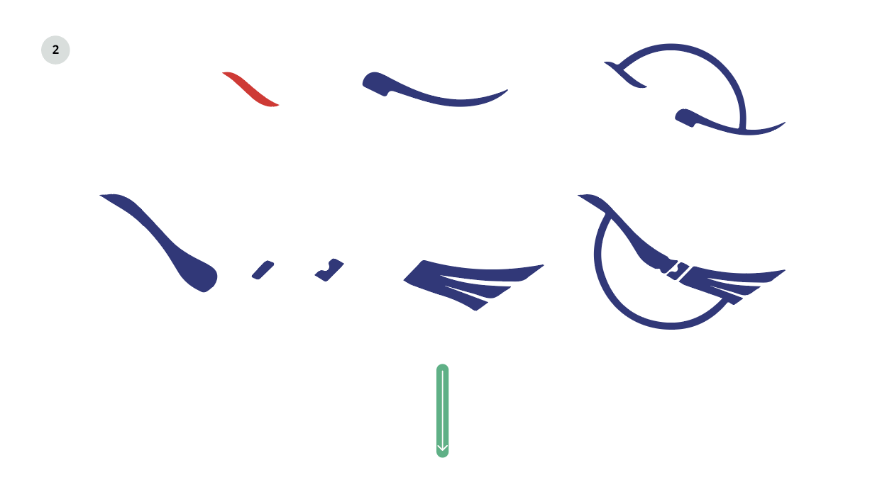
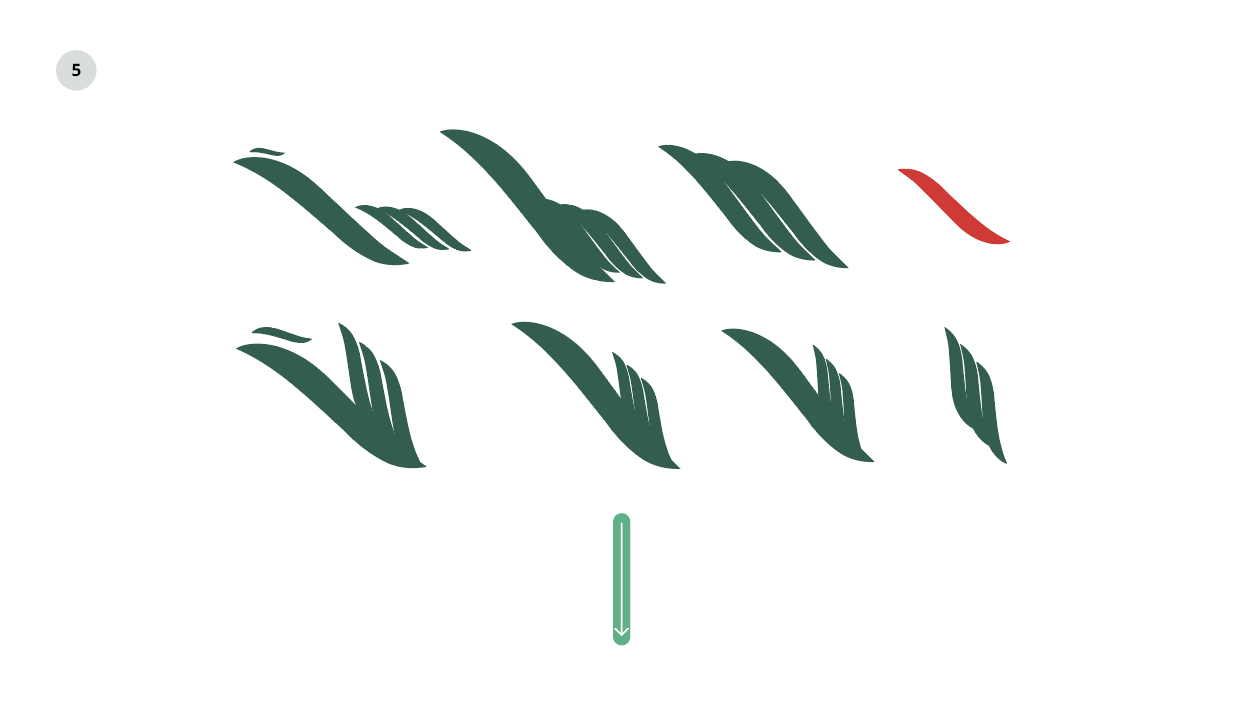
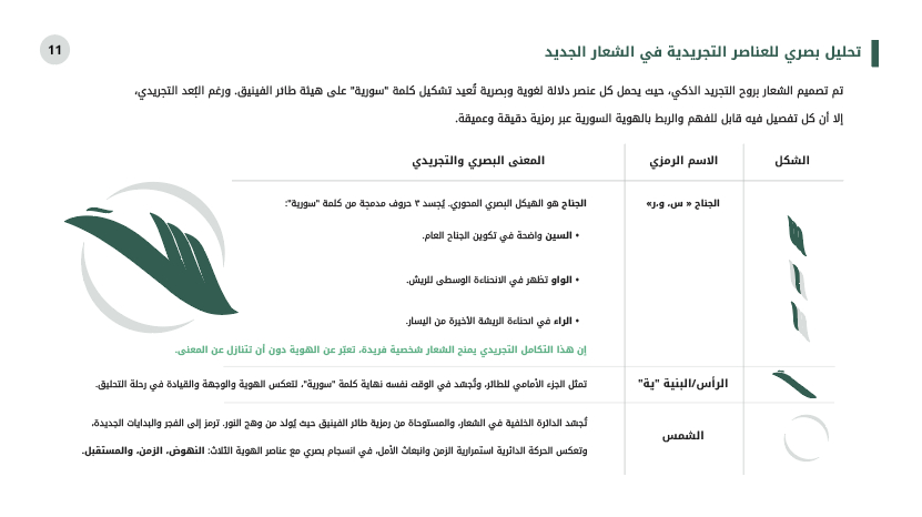
I identified a key visual from the old logo — the shkhta of the taa marbouta — and used it as the seed for the new design. This approach symbolized the rebirth of the brand from its own legacy, maintaining continuity while ushering in a bold, modern image.
From there, I developed a full visual system:
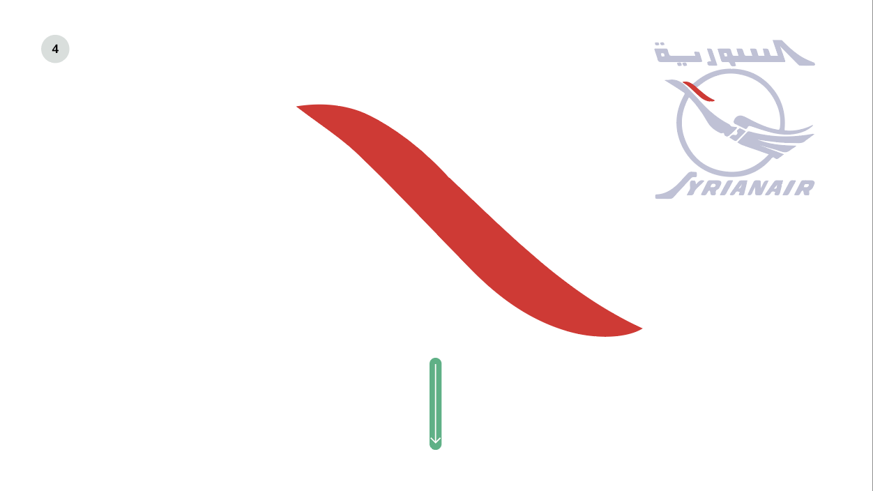
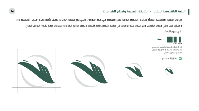
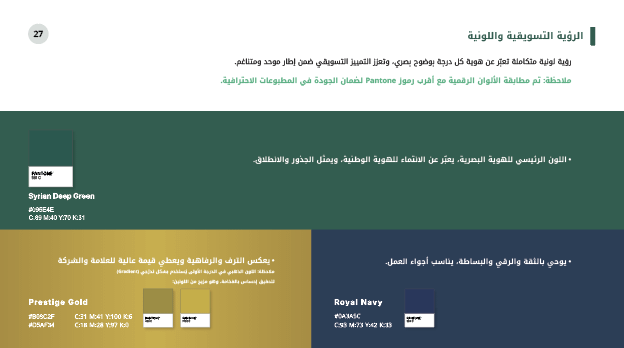
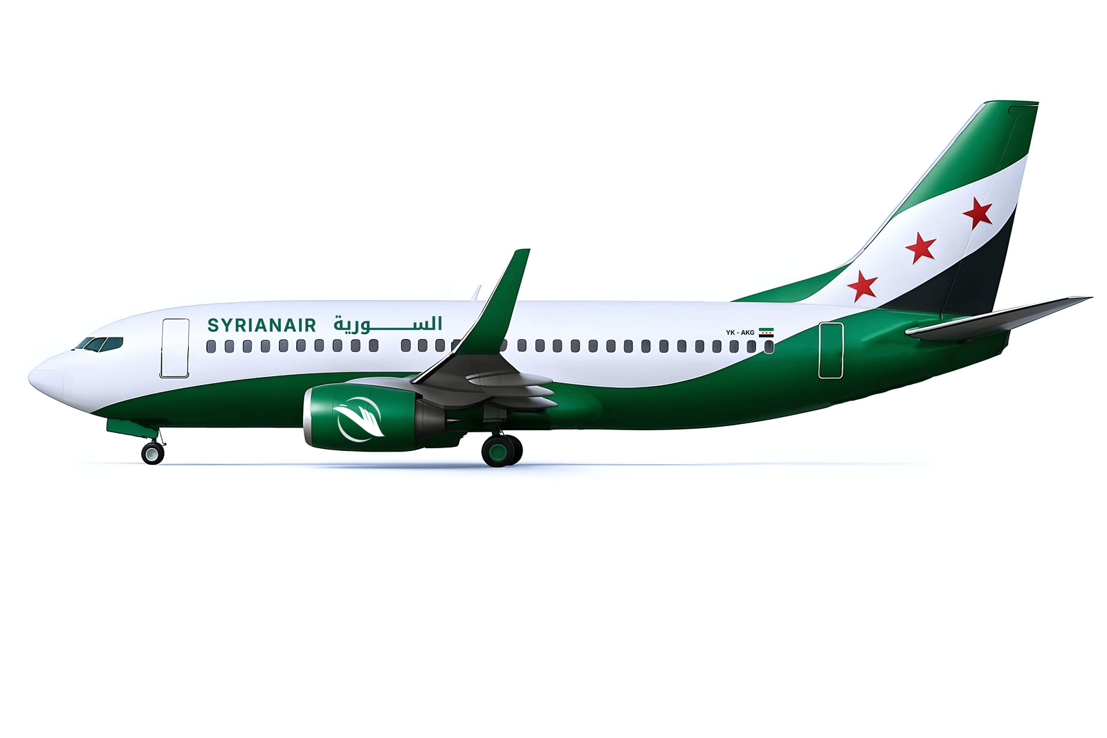
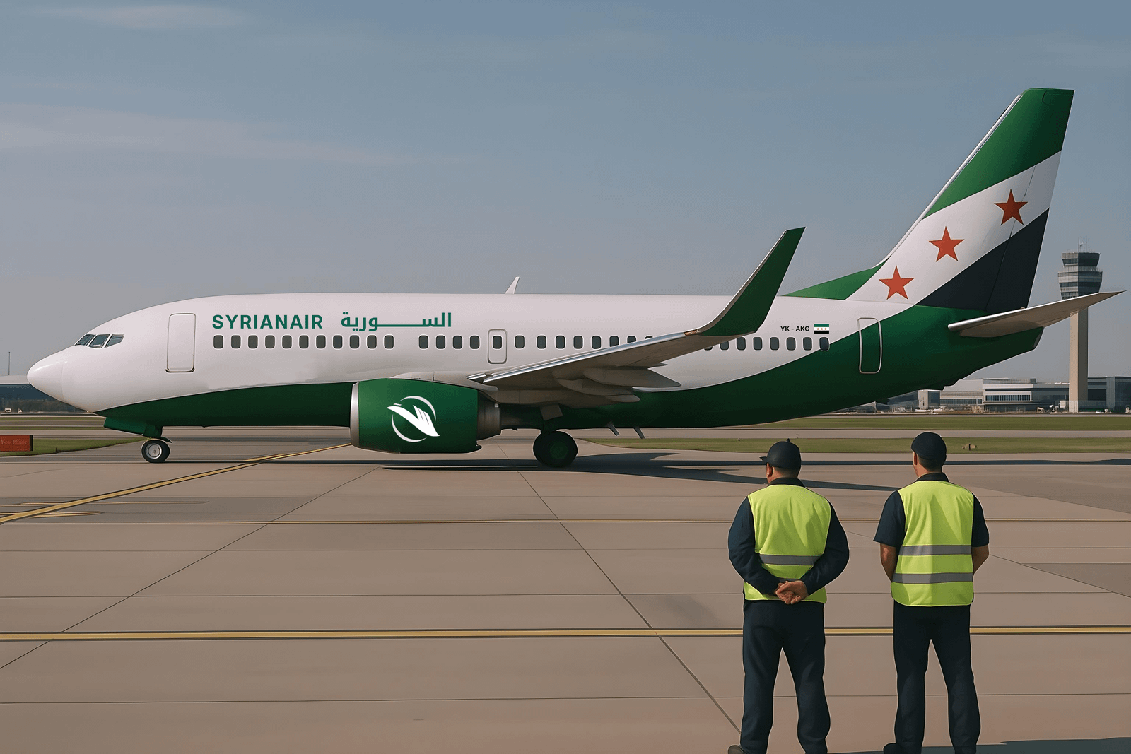
- Grid System built on precise proportions (73.2804px unit).
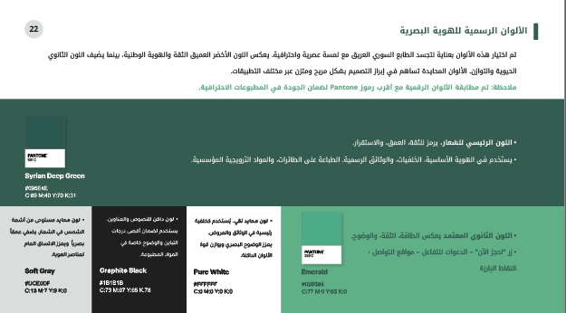
- Color Palette inspired by the Syrian landscape and heritage.
- Typography pairing Inter for English and Noto Kufi Arabic for Arabic to ensure harmony.
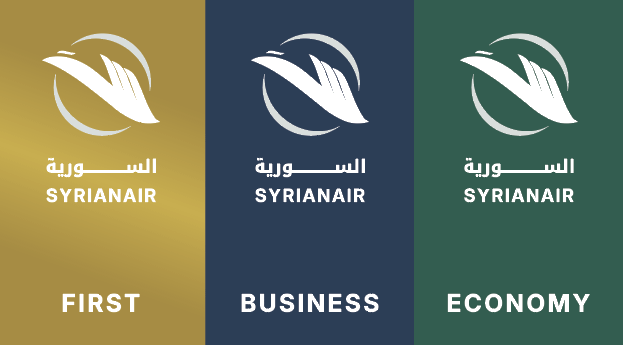
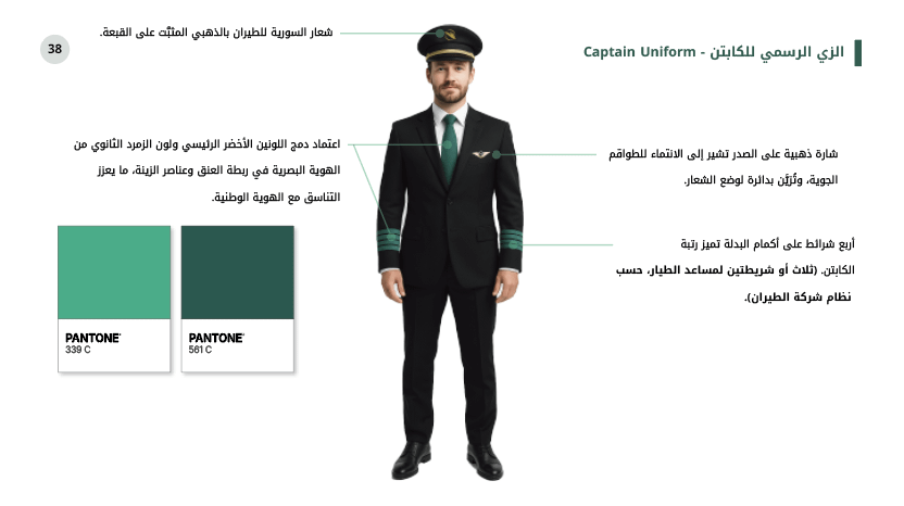
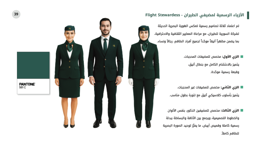
- Applications spanning aircraft livery, staff uniforms, passenger classes (Economy, Business, and proposed First Class), and digital/print collateral.
The result was a strategic visual identity that bridges history with contemporary design, crafted for both aesthetic excellence and operational practicality.
Highlights
Philosophy-Driven Design: Rooted in the phoenix rebirth concept for strong symbolic impact.
Legacy Integration: New logo evolved from a distinctive part of the old emblem.
Precision Engineering: Custom grid system ensuring perfect scalability and alignment.
Modern Yet National: Balancing global aviation standards with Syrian cultural identity.
Let’s Build Your Brand Together
If you’re looking to create a luxury visual identity and a seamless e-commerce experience, I can help bring your vision to life. Let’s make your brand stand out.